Hey there, web design enthusiasts! Whether you’re a seasoned pro or just getting started, keeping up with the latest trends in web design is crucial. The digital landscape is constantly evolving, and staying ahead of the curve can make a world of difference in how users interact with your website. Today, we’re diving into the hottest web design trends of 2024 that are sure to blow your mind and give your site that extra edge. Let’s get started!
Dark Mode Dominance
Why Dark Mode is Taking Over
Have you noticed that more and more websites and apps are offering a dark mode option? Dark mode has become incredibly popular, and for good reason. Not only does it look sleek and modern, but it also reduces eye strain, especially in low-light environments. Plus, it saves battery life on OLED and AMOLED screens—bonus!
How to Implement Dark Mode
Implementing dark mode on your website isn’t as hard as you might think. Most modern frameworks and CSS libraries support it. For example, you can use media queries in CSS to detect if the user prefers dark mode:
					@media (prefers-color-scheme: dark) {
  body {
    background-color: #121212;
    color: #ffffff;
  }
}
A few months back, I decided to add dark mode to my personal blog. The feedback was overwhelmingly positive, readers loved the new look, and I noticed a slight uptick in the average session duration. Trust me, it’s worth the effort!
Minimalist Design with Bold Typography
Less is More
Minimalism in web design is all about stripping away the unnecessary and focusing on the essentials. It’s not just a trend; it’s a philosophy that leads to clean, fast, and user-friendly websites.
The Power of Bold Typography
One of the standout features of minimalist design in 2024 is the use of bold, eye-catching typography. Big, bold fonts can grab attention and convey your message clearly and effectively.
Tips for Balancing Minimalism and Bold Typography
When I redesigned a client’s site last year, we decided to go for a minimalist look with bold typography. We used ample white space to make the text stand out and chose a strong, sans-serif font for headings. The result? A visually appealing site that clearly communicated the client’s brand message without overwhelming visitors.
3D Elements and Immersive Experiences
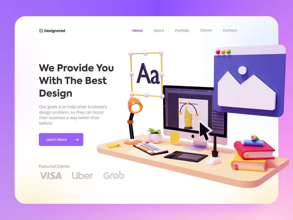
Bringing Websites to Life
3D elements are no longer confined to video games and movies. They’re making their way into web design, creating immersive experiences that captivate users. From 3D buttons to interactive animations, these elements can make your site stand out.
How to Add 3D Elements
Thanks to WebGL and frameworks like Three.js, adding 3D elements to your website is easier than ever. For instance, you can create a 3D logo that rotates as users move their cursor over it. However, it’s important to balance aesthetics with performance to ensure a smooth user experience.
Personal Experience with 3D Design
I experimented with 3D elements on a project for a tech startup. We added interactive 3D product models that users could spin and zoom in on. Not only did this increase engagement, but it also helped users understand the products better. The client saw a notable increase in on-site time and conversions.
AI and Chatbots for Enhanced User Interaction
The Rise of Smart Websites
Artificial Intelligence (AI) and chatbots are revolutionizing how we interact with websites. They provide instant support, answer queries, and even offer personalized recommendations, making the user experience smoother and more engaging.
Integrating AI and Chatbots
Integrating AI into your site might sound complex, but platforms like ChatGPT, Dialogflow, and various chatbot plugins make it quite manageable. You can start with simple chatbots that handle basic inquiries and gradually move to more advanced AI that learns from user interactions.
Anecdote on AI Implementation
I remember integrating a chatbot for a client who runs an online bookstore. Initially, the bot handled simple queries like book availability and shipping times. Over time, it learned to recommend books based on user preferences. The client reported a significant boost in customer satisfaction and sales—proof that AI can indeed work wonders!
Micro-Interactions for Better Engagement
Small Details, Big Impact
Micro-interactions are those tiny animations or design elements that provide feedback to users. Think of a button that changes color when you hover over it or a form that shakes when you enter the wrong password. These small details can greatly enhance user experience by making your website feel more interactive and responsive.
How to Implement Micro-Interactions
Tools like LottieFiles and libraries such as Animate.css make it easy to add micro-interactions to your site. Start with simple effects like hover animations and progress to more complex interactions as you become comfortable.
My Take on Micro-Interactions
When I first added micro-interactions to a client’s e-commerce site, I was skeptical about their impact. However, the feedback was instant and positive—users loved the responsiveness and the site’s overall feel. It’s amazing how these small touches can create a more engaging and enjoyable experience.
Asymmetrical Layouts for Visual Interest
Breaking the Grid
Gone are the days of rigid, grid-based designs. Asymmetrical layouts are all about breaking the mold and creating unique, dynamic designs that catch the eye. They bring a sense of movement and creativity to your site, making it more memorable.
Creating Balance with Asymmetry
While asymmetrical designs are visually intriguing, it’s crucial to maintain balance to avoid a chaotic look. Use visual hierarchy to guide users’ attention to key elements and ensure that the overall design remains coherent and user-friendly.
Experimenting with Asymmetry
I once worked on a project for a fashion blog where we used asymmetrical layouts. By carefully placing images and text in non-uniform arrangements, we created a dynamic and stylish look that perfectly matched the brand’s edgy aesthetic. The client’s site stood out in a crowded market, attracting a larger audience.
Voice User Interface (VUI) Integration
Talking to Your Website
With the rise of voice-activated devices like smart speakers and virtual assistants, integrating Voice User Interfaces (VUI) into websites is becoming increasingly important. VUI allows users to navigate and interact with your site using voice commands, providing a hands-free experience.
Implementing VUI
Integrating VUI can be done using APIs from major tech companies like Google and Amazon. Ensure that voice commands are intuitive and responsive, and test thoroughly to provide a seamless experience.
Case Study on VUI
I added VUI capabilities to a client’s recipe website, allowing users to navigate recipes and instructions using voice commands. This not only enhanced the site’s accessibility but also provided a convenient way for users to follow recipes without touching their devices. The feedback was overwhelmingly positive, particularly from users who loved cooking along with voice-guided instructions.
Sustainable Web Design Practices
Going Green
Sustainability is not just a buzzword; it’s a responsibility. As web designers, we can contribute by adopting eco-friendly practices that reduce the carbon footprint of our websites. This trend is gaining momentum as more users and businesses become environmentally conscious.
How to Design Sustainably
Optimize images and videos to reduce load times, use green hosting providers, and minimize unnecessary code. These steps not only make your website eco-friendly but also improve performance and user experience.
My Journey Towards Sustainability
After attending a seminar on sustainable web design, I decided to implement green practices on my own site. I switched to a green hosting provider and optimized all media content. Not only did I feel good about reducing my carbon footprint, but I also noticed faster load times and better performance metrics. It’s a win-win situation!
Conclusion
Staying updated with the latest web design trends is essential for creating websites that are not only visually appealing but also functional and user-friendly. From dark mode and bold typography to AI chatbots and sustainable practices, 2024 offers exciting opportunities to enhance your web design game. So, don’t be afraid to experiment and innovate—your users will thank you!

